First up... a new way to display an inspirational quote.
After the wainscoting and shelf ledge went up, the upper wall area was lookin a little lonely...

I knew right away I wanted to incorporate some sort of inspirational quote, as a studio should be an inspiring place to spend your day.
Instead of slapping something up on the wall, I thought a little harder and decided that something suspended from the ceiling could be a neat alternative.
Step 1 was to choose my quote. One of my favorites is from a very smart man by the name of Walt Disney...

This quote feels very relevant to me, as I started with just a dream myself and am now aiming to make it my reality.
After that was settled, I figured the easiest way would be to paint the words onto wood (something I am quite familiar with).
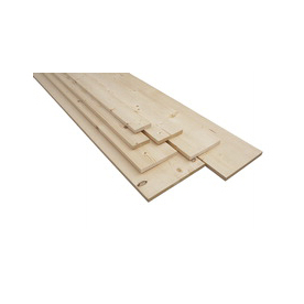
I picked out a 1x3 plank of Whitewood from Lowe's. This type of wood is my favorite because it's a light, neutral color (not orangey), it's very lightweight, and it's also very soft which means easy to imprint/modify for projects like these.
I thought I'd also fancy it up a bit by notching out a little flag/banner shape on the edges. I did this once before on a smaller scale and loved the way it turned out:

For this part, I got to use my brand new jigsaw for the first time. It was fun!

After the edges were shaped, I decided to go with a rustic look and weather the wood using tools I had lying around.

Since the wood is so soft, it dents easily which is perfect for this process.
After it was distressed enough to my liking, I gave it around 4 coats of my go-to stain, Minwax in Ebony, and let it dry for a few days.

Then I had to make my word template.
For this part, I measured the height and length the overall quote had to be, typed it out in Illustrator and spaced the words appropriately, and then printed them out using several pages of plain paper:

Then I cut boxes around the letters so I could easily tape them within the wood piece, like so:

I carefully lined up my words and taped them down...

Then I took a pen and pressed firmly on the outline of the letters to leave an imprint in the wood.
See it?

Using a small paint brush and a steady hand, I filled in the letters, one by one...

After probably an hour, it was done!

Now it was time to hang this baby.
After considering my options, I decided hooks and twine would be a good solution. The board is so light that it doesn't need anything heavy duty (like chains).
I picked up a pack of eye hooks, and screwed one in on each end (by hand):

Then we hung it up to the ceiling, made our marks for the ceiling hooks, and used inserts to secure the top hooks into.
Once the hooks were in, I snipped off some twine, knotted them tightly and it was good to go.


I love my hanging sign. It makes me happy :)
Ready for the next one?
With the amount of paper and scraps I go through on a daily basis, I needed a pretty substantial waste bin to contain everything so I don't have to empty it 24/7. I'd been using a wicker basket in my old office but it was too small and not very efficient.
Enter the steel tub.

I purchased the 16 gallon version on Amazon because I loved the rustic look, the size was perfect, and it was just $26 shipped.

It was technically cool looking enough to leave as is, but I wanted to jazz it up a bit.
So I printed this out and cut each letter out using my Xacto knife:

I wanted to add a white stripe across the center and have the word RECYCLE show through in the bare steel.
The first step was using painters tape around the edges of my border:

Then I cut some plastic sheets and taped them on top and bottom so they wouldn't get sprayed.

Once it was prepped, I whipped out my trusty spray adhesive (I've had this bottle for years—works every time)

I gently sprayed the back of my letters, and used a piece of tape to line them up.

After a few light coats of paint (with some drying time in between), I peeled off my letters and admired the results.

It adds a nice touch, don't you think?


And that's as much as I can show you for now before the big reveal!
But I do want to mention my other latest Amazon purchase... (if photography doesn't float your boat, you may want to skip the rest of this post!)

Hello, lovely 24mm f2.8!
Here's the deal. I'm obsessed with my 50mm f1.4. It's so perfect in every way, I rarely even have to touch the photos in processing before posting. I use it every chance I get... except that doesn't happen too often because 50mm is not ideal for full room shots.
So a while back I bought a 10-22mm f3.5-4.5 thinking the wide angle lens would be perfect, but I didn't love it. And I've finally realized that the small aperture is what's killing me.
Unfortunately, I'm not in a position to drop $1500 on a 24mm 1.4, so after some research, I figured the best compromise would be the 24mm 2.8.
It's pretty much exactly what I had expected, and I do like it. I'm still trying to decide if I want to sell my 10-22, because it does come in handy with the small rooms in my house. It just sucks in low lighting, which is pretty much my whole house minus the sunroom.
Just for fun, I've done some comparison shots with all 4 lenses I own (all Canon): 10-22mm f3.5-4.5, 24mm f2.8, 50mm f1.4, and the 18-55 f3.5-5.6 kit lens.
These are all straight out of camera shots, no cropping or editing at all (aside from the 'enable lens profile corrections' checkbox in RAW). I tried to keep the focal length about the same (except the 50mm of course). The goal was to keep a low aperture so you can see the difference in the lenses capability as much as possible—so I set it on Av and had the camera do the rest to even the playing field as much as possible.
Disclaimer: I know some of these photos are dark. And also the ISO is too high (800). All shots taken with a T2i.
Ready? Here's scene #1. The focal point was on the center of the light aqua pillow, for reference.
10-22mm:

24mm:

18-55mm:

50mm:

Not much of a difference between the first 3 lenses, although you can see the subtle background blur from the 24mm. In a larger room like this it isn't as noticeable, but in a smaller room it really makes a difference.
Scene 2.
10-22mm:

24mm:

18-55mm:

50mm:

The focal point in these shots was the top right corner of the black printer, and in this situation there is less of a noticeable depth of field difference.
And finally, Scene 3. I realize this setup sucks with the over and underexposed rooms, but I chose it because there are objects both close up and far away to illustrate the DOF. The focal point is on the sunroom pillows.
10-22mm:

24mm:

18-55mm:

50mm:

Here you can definitely tell the 24mm from the 10-22 and kit lens with the out of focus couch and chest, and that is the reason I bought this lens. It would be nice to have a slightly wider focal length, but I had to compromise somewhere.
I'm still just at the beginning stages of learning my way around my camera and different lens options so I am nowhere near an expert at any of this. But it does help me to get an idea of how different lenses perform under identical conditions though, so hopefully this is helpful to someone else in the market for a new lens. (And if you are, be sure to check out this most helpful camera & lens review site).
I'd love to hear about your favorite lenses for shooting interiors (I wish there was more resources on this out there!), or your thoughts/tips/opinions!
Next week is the big studio reveal, whew!

0 comments:
Post a Comment